Visualizing or visualising? Doesn’t really matter.
The idea here is to render the Sydney Rail Network (aka CityRail) using Cytoscape, an open source application typically used by researchers to visualizing bioinformation. My original idea was actually to visualize something plain like Facebook friend networks but decided on the CityRail niche because it partly relates to my work.

Depressing as it may sound, I’ve been itching to do something related to work outside of work. An original idea was to make papercraft model trains, but I’m too lazy to go around taking photos of trains (I actually hate trains…).
So lets start!
Requirements :-
- Information must be publicly available. i.e. I can’t use confidential information and get fired for it…
- The end result has to be both ‘useful’ and ‘pretty’. i.e. I can’t fail this one since they’re both subjective…
- This can’t take too long or I’ll view this as too nerdy an exercise and give up…
Method :-
- Get the CityRail timetable.
- Parse it.
- Generate a fancy visualization based on the data.
Definitions (This is/was written down for my own benefit…I haven’t started yet…) :-
- A node is a train station on the Sydney metropolitan network (CityRail)
- A node is categorized by how many trains start/stop/end at this station.
- A link(edge) between two nodes is created when a train leaves one station/node and stops at another without any intermediate stops.
- A link(edge) is categorized by the distance between the two nodes, the average time for all trains to transverse the link, and the average speed of trains on this link.
Result :-

Some explanations and a bit of review…
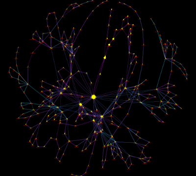
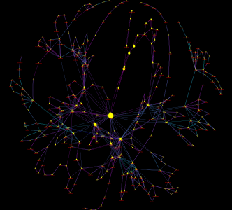
The layout is based on link weighted springs, basically the length of the link is representative of the distance between the stations.
The link colour represents the average speed of trains on that link. Light blue is fast/good, purple is slow/bad.
The node/station size represents the number of trains that stop at that station. Central is huge! Redfern, Town Hall, Sydenham and Strathfield are also obviously key hubs as well.
This took way longer than expected…I made heaps of typos in the parser script and debugging it was hell because the typos all looked ‘legitimate’ (e.g. I typed ‘stations’ instead of ‘nodes’ as the table name…).
But hey the exercise was fruitful. Its pretty! It shows some interesting pieces of information (which I won’t spell out)…
Post a comment if you are interested in the cytoscape source file or a SVG vector graphics file of the image 🙂
Author’s Note : I’m an avid ‘avoider’ of train travel.