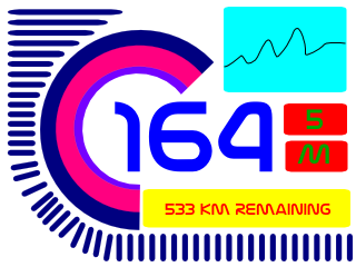
Working a 70 hour week dampened my enthusiasm for the MChumby but I managed to scrape a couple of hours today to try my hand with HaXe + Flash to prototype the Chumby Interface.
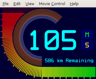
A few interesting tidbits were learned from the experiments :-
- HaXe + Geany are great for developing flash widgets for the Chumby
- Gnash doesn’t render the same as Linux Adobe Flash
- Chumby renders the same as Adobe Flash
- Text vertical alignment in flash is crap
A bit of background and a demo video of the widget on the Chumby after the break.
The last post describes my resurrection of a two year old project. Here’s a super short summary with many pictures, photos and videos!
The original layout
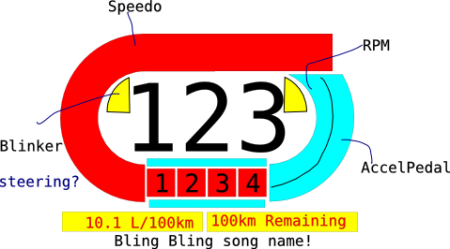
Original layout prototyped
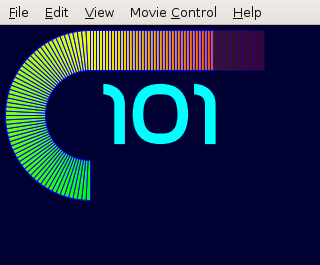
I thought the speed gauge didn’t look too bad but I got convinced by a friend to redesign the layout. Plus I really didn’t know why I needed a song name on the display or the blinker indicators…
The revised layout
Revised layout legend/summary :-
- The speed gauge is the outer display.
- The arcs are for the tachometer and accelerator position.
- The yellow bar is like a fuel remaining indicator
- Red boxes are for the transmission (mode/gear)
- The cyan box is for a graph of… don’t know yet. Speed graph? Fuel economy graph? Any suggestions?
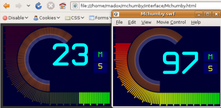
Gah Gnash vs Adobe Flash
I’ve been using Geany to write the HaXe code for this and it is pretty easy to link it in with Gnash to view the resultant Flash when compiling/executing. So all it all it seemed like a good package for flash development until I realised Gnash doesn’t render quite the same as Adobe… (“Gah” is my sign of exasperation that Gnash renders the flash differently…).
That’s not the important bit…the important bit is that it doesn’t render like the Chumby either!!! ARGH. (P.S. The fault is with Gnash rendering textfields vertically centered whereas flash render’s them top aligned, easy enough to fix…)
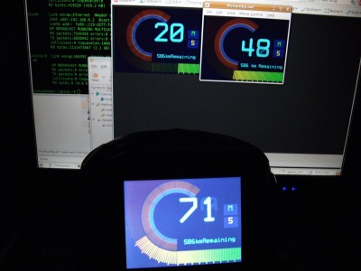
Chumby gesture interface test video
Works pretty well I have to say 🙂 What do you think?
